Hey guys! Please be patient, brand new blog and I'm updating as I go! I'm fine tuning lessons and making more!

Thursday, August 14, 2014

Welcome to Scrapping - Video Lesson 1!


Hi Guys! I'm venturing into doing some video tutorials. These are loaded to you tube, so you can access them there as well.

This is just a basic, "welcome to scrapping" that corresponds with the typed out welcome HERE

Check it out and let me know what you think! I'm going to do some more as it's easier for me and more interactive. I hope you enjoy!

-Shani

Sunday, February 24, 2013

Lesson 5: How to use a script!

Yes Scripts can be intimidating! Especially if you are new to PSP. I personally love them and have a few of my faves out there. I hope this makes sense!

Supplies: PSP any version, I use 11

Script I used a freebie from HERE


NOTE:


Here's how I start out :


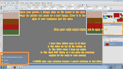
Open your folder where your script is you want to use. I do NOT load my scripts to the script folder in My PSP files, only because it bogs down my PSP and I have more control over what I'm doing.

In the folder you will see many things. Selections, the script anything  else that is needed to run it. Copy the selections in your script folder. THen pop over to your MY PSP FILES folder. Note: Mine is in my documents, it's not IN the program folder on the hard drive. Weird I know lol. 

Then Paste the selections into the sections folder. Sometimes there will be picture tubes, textures or patterns that need to be copied over to their respective folders as well. Real simple just copy and paste! :)


Then go back to where your script is that you want to use. Double click on the script and there you go...a pop up screen shows up in PSP. Follow the prompts and there you got it! Congrats :D Follow the instructions, merge THEN save :)


Once you've done that, your done with  your first script! Congrats!


Monday, January 7, 2013

Lesson 4: How to use a template


Of course a lot of us use templates wit our tags. Here I'm going to show you how to use a template, a simple way. The next lesson I'll show you how to use templates another way.

Firs things first, you need this template here: http://www.deliciousscraps.com/2011/01/new-free-commercial-use-scalloped-heart.html

make sure you leave her some love!

-Have your color palette open! You will notice that I usually work with the palette open on both sides of my PSP. This works better for me.

Next you are going to open your template in PSP....make sure you open the PSD or PSPIMAGE. We need to be able to work with the layered version.

So once you open the template in PSP this is what you will see:


Now we're going to colorize each layer. Using your MCB (manual corection button, refer to paper lesson).

Once you hit the MCB, a window comes up asking you what you want to change the color to. Move the window to the side a little like I have so you can see which layer you are working with. Right now it should be the scalloped heart layer.  Move your mouse so it hovers over the scalloped edge and the dropper tool comes up. What we're going to do is "pick up" that color. Click on it and it will pick it up. The top colored box in your window will now change to that color. On the bottom color box, click it and choose the color you want to change it to. Click ok.

 
Next you are going to repeat that process with the next layer. Remember to pick up the original color of the template! Just like before


So now we're going to do the same thing for the next layer. Remember to pick up the color and drop in a new one!


Now the fun part!!! We're going to do some "shading" to make it pop out and look a bit more three dimensional.

Go to your scalloped later and duplicate it twice. you should now have three of them.
-NOTE I forgot to duplicate it for the third time in my screen shot. Essentially this is what it looks like


Close off the top one and on the middle one, go to effects>3d effects>cutout


Once you do that this window will pop up with whatever the default is:


We're going to change that! This is where you can have fun changing the settings to get the desired depth you want. Move the window to the right a little so you can see it better. on the color window, click it and change the color to just a few shades darker than the one you had originally chosen. This is going shadow it a bit and give it more depth. You can play with the offset settings, or you can choose mine. Totally up to you!


Open up the top scalloped layer. You are going to repeat this process but remember to do the opposite numbers on the offset you did before. For example if you did 5 and -5 before you are now going to do -5 and 5.


Now you are going to move up to the next layer. Duplicate the heart twice so now you have three layers. Close off the top heart layer


We're going to follow the same process as before! Again you can either choose my settings or mess with it on your own.


Open up the top heart layer and repeat:


Duplicate the top heart layer twice, so you now have three. Close off the top one:


We're going to repeat the process again, remember to use a color a few shades darker than your original!


Last layer! Open the top layer and repeat:


In the end this is what I came up with! Pretty cool huh? Just a little bit of shading and contrast can take a simple template into a whole new direction!


Have fun and use your imagination!

Lesson 3: How to use an overlay

Here we go! working on papers can be really fun. There are so many things you can do! For this lesson, I want you to use this overlay I've provided. Get it HERE *note this overlay was made by me. If you use it in your kits please credit me!


One of the main tools you will be using is the Manual Color correction button. Follow the steps in the screen shot below!


When you are satisfied with how your overlay looks save it as a jpeg file. Saving as a jpeg will take up less room in your file folder. Just a small tip there :)
I hope you have found this lesson useful!


Wednesday, November 7, 2012

Lesson2: Resizing your elements

You're making your way through your first scrap kit! Congrats!!!!

One of the things I detest as most taggers do is opening a kit and OMG the pieces are too small or too big, lots of empty space..etc. Now this is one of the biggest things you need to remember to do. I create mainly tagger size kits, so this lesson is set based on that, a tagger size kit.

Remember, you can size down but you can't size up. Try it, open a tagger size element from a kit you either downloaded or bought. Try to increase the size, see how pixely it gets? Doesn't work very well does it? Always keep that in mind.

First I want you to go Granny Arts Blog and grab any full size element. Unzip it then open it up in PSP.

Then go to image, then resize. Resize your element using the percentage. Look in the blue bar (look to pic for example) and see what the percentange is? That's what I resized it down to.


Then you need to use your cropping tool.  Adjust it so it it's close to the element. You don't want "empty" space around the element.


Right click, and apply. once you've done that save it into your folder!


Original scrap tutorial by shani aka wicked princess 2011-2012


Monday, October 15, 2012

Disclaimer and TOU

I am sharing on this blog, my secrets on how I personally approach and make kits. Many things I have learned either on my own through trial and error and through various websites. It is not my intention in any way shape or form to copy, rip, or immitate ANY other lessons or websites through my lessons. I have learned on my own for a few years and now wish to help others! I use mainly Corel Paint Shop Pro for my lessons unless otherwise mentioned. I will do my best to link to sites that may help you to further learn!

I do nto condone sharing! I will only share LINKS to WEBSITES where you may download free to use commercial use items, or free to use items. If I have made them myself, I will post links for download.

Please abide by the TOU of all designers you acquire items and information from. Please direct people to my blog for more information and help. Do not rip my lessons or screen shots! I f you have questions please ask. You may reach me on facebook HERE or by email superrainpolly@gmail.com at anytime. Please allow 24 to 48 hours for returned emails/messages


Thank you and have fun!
Shani
Wicked Princess Scraps/Shani's Scrappin' Secrets

Lesson 1: Choosing a Color palette


Creating a theme and color palette:

You’re probably thinking, “I’ve read the intro, now what?” Here is where the creativity comes in to play!
First things first, decide on a theme! For me my themes can come from something random I think up, some supplies that I saw or something as simple as a suggestion.

Some people use sites like http://www.colourlovers.com/ to find a palette. Some use supplies or a picture as an inspiration.

For my example I’m going to use one of the CU ok tubes I have from Lisa @ sophisticated imaging. This is a freebie one btw. You can find it HERE 

And PSP 10

I pull up the preview in my PSP. I increase the size to it’s full 100 percent, so I can grab the colors as I like. I also figure out which one in the preview I want to use. I like bright colors so I am going for the bright colored one.

I open a new canvas, sized 500x500, transparent and a raster layer. Yup this is big, but remember we are cropping it down.


I move it so it’s side by side with my preview. This way I can work easily.
Now I make my preset tool active, and use the rectangle tool. BTW I just leave it at the default settings for everything.


I move my cursor to the color palette box to the right. I close off the top box. Then I click on the bottom one to pull up the materials palette. Using my cursor, I hover over the spot where I want to “pick up” one of the colors. As you can see from the preview, I’m picking up a pink color. I click ok and now I can draw out my rectangle. I draw out a pretty large rectangle. I do this to give myself enough space. Don’t forget to convert it to a raster layer. This way you are getting each rectangle on it’s own layer and you can move them as you need to.


I continue this process until I get the desired colors I want. I suggest doing at least 4 colors. You can use black and/or white as your main colors or accent colors. It’s all about your creativity!

Finally use your crop tool, and move the cropping rectangle to where you like it. Then right click and hit apply! Now you have your color palette. Save it and you’ve got your palette.


Lesson Created by Shani aka Wicked Princess Scraps 2011-2012